Style Guide
A complete guide to IUCN SOS styles and interface elements.
All
Responsive breakpoints
| Breakpoint name | XS | SM | LG |
|---|---|---|---|
| Breakpoint size | < 768px | ≥ 768px | ≥ 1200px |
| Class prefix | .col- |
.col-sm- |
.col-lg- |
| Container Max Width | 600px |
1000px |
1264px |
Color utilities
Text color utilities
| Utility class | Example |
|---|---|
.text-primary-1 |
Example |
.text-primary-2 |
Example |
.text-primary-3 |
Example |
.text-success |
Example |
.text-warning |
Example |
.text-danger |
Example |
.text-white |
Example |
Background color utilities
Primary Colors
.bg-primary-1
.bg-primary-2
.bg-primary-3
Secondary Colors
Status Colors
.bg-success
.bg-warning
.bg-danger
Grayscale Colors
.bg-white
Type
Type scale
| Example | Font size | Line height
(unitless) |
Line height computed
(font-size x line-height) |
Class |
|---|---|---|---|---|
Font size level 1 |
font-size: 3.4rem |
line-height: 1.4117647058824 |
4.8rem
|
.fl-1
|
Font size level 2 |
font-size: 2.8rem |
line-height: 1.4285714285714 |
4rem
|
.fl-2
|
Font size level 3 |
font-size: 2.4rem |
line-height: 1.3333333333333 |
3.2rem
|
.fl-3
|
Font size level 4 |
font-size: 2rem |
line-height: 1.2 |
2.4rem
|
.fl-4
|
Font size level 5 |
font-size: 1.6rem |
line-height: 1.5 |
2.4rem
|
.fl-5
|
Font size level 6 |
font-size: 1.4rem |
line-height: 1.7142857142857 |
2.4rem
|
.fl-6
|
Font size level 7 |
font-size: 1.2rem |
line-height: 1.3333333333333 |
1.6rem
|
.fl-7
|
Display
| Example | Font size | Line height (unitless) |
Line height computed (font-size x line-height) |
Class |
|---|---|---|---|---|
Display level 1 |
font-size: 6.4rem |
line-height: 1.25 |
8rem
|
.display--1
|
Display level 2 |
font-size: 4.8rem |
line-height: 1.3333333333333 |
6.4rem
|
.display--2
|
Display level 3 |
font-size: 3.4rem |
line-height: 1.4117647058824 |
4.8rem
|
.display--3
|
Display level 4 |
font-size: 2.4rem |
line-height: 1.3333333333333 |
3.2rem
|
.display--4
|
Display level 5 |
font-size: 1.6rem |
line-height: 2 |
3.2rem
|
.display--5
|
Body text
Lorem ipsum dolor and a link, consectetur adipisicing elit. Recusandae, rerum perferendis quos aspernatur ullam eos voluptate quo cupiditate assumenda facilis, iste animi doloremque, quasi eveniet laboriosam. Dolor perferendis debitis dolore. Repellendus laudantium, quas excepturi ducimus reiciendis, eligendi unde quia perspiciatis voluptatibus pariatur repellat quibusdam, molestiae cum quaerat ex a modi neque? Id officiis doloremque nisi, veritatis fugit fugiat eveniet placeat?
Officia, veniam. Molestias harum quasi, explicabo nesciunt fugit dicta provident natus veniam eveniet eos doloremque dolor, similique voluptates qui adipisci repudiandae iste sit nobis soluta error dolore accusamus fugiat, porro.
Headings
| Example | Heading | Font size level |
|---|---|---|
Heading 1 |
<h1> |
Font size level 2 |
Heading 2 |
<h2> |
Font size level 3 |
Heading 3 |
<h3> |
Font size level 4 |
Heading 4 |
<h4> |
Font size level 5 |
Heading 5 |
<h5> |
Font size level 6 |
Heading 6 |
<h6> |
Font size level 7 |
This is an <h1> tag with some trailing text
Lorem ipsum dolor sit amet, consectetur adipisicing elit, sed do eiusmod tempor incididunt ut labore et dolore magna aliqua. Ut enim ad minim veniam, quis nostrud exercitation ullamco laboris nisi ut aliquip ex ea commodo consequat. Duis aute irure dolor in reprehenderit in voluptate velit esse cillum dolore eu fugiat nulla pariatur. Excepteur sint occaecat cupidatat non proident, sunt in culpa qui officia deserunt mollit anim id est laborum.
This is an <h2> tag with some trailing text
Lorem ipsum dolor sit amet, consectetur adipisicing elit, sed do eiusmod tempor incididunt ut labore et dolore magna aliqua. Ut enim ad minim veniam, quis nostrud exercitation ullamco laboris nisi ut aliquip ex ea commodo consequat. Duis aute irure dolor in reprehenderit in voluptate velit esse cillum dolore eu fugiat nulla pariatur. Excepteur sint occaecat cupidatat non proident, sunt in culpa qui officia deserunt mollit anim id est laborum.
This is an <h3> tag with some trailing text
Lorem ipsum dolor sit amet, consectetur adipisicing elit, sed do eiusmod tempor incididunt ut labore et dolore magna aliqua. Ut enim ad minim veniam, quis nostrud exercitation ullamco laboris nisi ut aliquip ex ea commodo consequat. Duis aute irure dolor in reprehenderit in voluptate velit esse cillum dolore eu fugiat nulla pariatur. Excepteur sint occaecat cupidatat non proident, sunt in culpa qui officia deserunt mollit anim id est laborum.
This is an <h4> tag with some trailing text
Lorem ipsum dolor sit amet, consectetur adipisicing elit, sed do eiusmod tempor incididunt ut labore et dolore magna aliqua. Ut enim ad minim veniam, quis nostrud exercitation ullamco laboris nisi ut aliquip ex ea commodo consequat. Duis aute irure dolor in reprehenderit in voluptate velit esse cillum dolore eu fugiat nulla pariatur. Excepteur sint occaecat cupidatat non proident, sunt in culpa qui officia deserunt mollit anim id est laborum.
This is an <h5> tag with some trailing text
Lorem ipsum dolor sit amet, consectetur adipisicing elit, sed do eiusmod tempor incididunt ut labore et dolore magna aliqua. Ut enim ad minim veniam, quis nostrud exercitation ullamco laboris nisi ut aliquip ex ea commodo consequat. Duis aute irure dolor in reprehenderit in voluptate velit esse cillum dolore eu fugiat nulla pariatur. Excepteur sint occaecat cupidatat non proident, sunt in culpa qui officia deserunt mollit anim id est laborum.
This is an <h6> tag with some trailing text
Lorem ipsum dolor sit amet, consectetur adipisicing elit, sed do eiusmod tempor incididunt ut labore et dolore magna aliqua. Ut enim ad minim veniam, quis nostrud exercitation ullamco laboris nisi ut aliquip ex ea commodo consequat. Duis aute irure dolor in reprehenderit in voluptate velit esse cillum dolore eu fugiat nulla pariatur. Excepteur sint occaecat cupidatat non proident, sunt in culpa qui officia deserunt mollit anim id est laborum.
Lists
Default list styling
Unordered list:
- Lorem ipsum dolor sit amet
- Consectetur adipiscing elit
- Integer molestie lorem at massa
- Facilisis in pretium nisl aliquet
- Nulla volutpat aliquam velit
- Phasellus iaculis neque
- Purus sodales ultricies
- Vestibulum laoreet porttitor sem
- Ac tristique libero volutpat at
- Faucibus porta lacus fringilla vel
- Aenean sit amet erat nunc
- Eget porttitor lorem
Ordered list:
- Lorem ipsum dolor sit amet
- Consectetur adipiscing elit
- Integer molestie lorem at massa
- Facilisis in pretium nisl aliquet
- Nulla volutpat aliquam velit
- Phasellus iaculis neque
- Purus sodales ultricies
- Vestibulum laoreet porttitor sem
- Ac tristique libero volutpat at
- Faucibus porta lacus fringilla vel
- Aenean sit amet erat nunc
- Eget porttitor lorem
Definition list:
- Time
- The indefinite continued progress of existence and events in the past, present, and future regarded as a whole.
- Space
- A continuous area or expanse that is free, available, or unoccupied.
- The dimensions of height, depth, and width within which all things exist and move.
List unstyled
Use .list-unstyled or extend %list-unstyled to get an unstyled list. This only applies to immediate children list items, meaning you will need to add the class for any nested lists as well.
- Lorem ipsum dolor sit amet
- Consectetur adipiscing elit
- Integer molestie lorem at massa
- Facilisis in pretium nisl aliquet
- Nulla volutpat aliquam velit
- Phasellus iaculis neque
- Purus sodales ultricies
- Vestibulum laoreet porttitor sem
- Ac tristique libero volutpat at
- Faucibus porta lacus fringilla vel
- Aenean sit amet erat nunc
- Eget porttitor lorem
Lists styled
Use .list-styled to add styling too lists. This only applies to immediate children list items, meaning you will need to add the class for any nested lists as well. Only <ul> and <ul> lists are supported.
Unordered list:
- Lorem ipsum dolor sit amet
- Consectetur adipiscing elit
- Integer molestie lorem at massa
- Facilisis in pretium nisl aliquet
- Nulla volutpat aliquam velit
- Phasellus iaculis neque
- Purus sodales ultricies
- Vestibulum laoreet porttitor sem
- Ac tristique libero volutpat at
- Faucibus porta lacus fringilla vel
- Aenean sit amet erat nunc
- Eget porttitor lorem
Ordered list:
- Lorem ipsum dolor sit amet
- Consectetur adipiscing elit
- Integer molestie lorem at massa
- Facilisis in pretium nisl aliquet
- Nulla volutpat aliquam velit
- Phasellus iaculis neque
- Purus sodales ultricies
- Vestibulum laoreet porttitor sem
- Ac tristique libero volutpat at
- Faucibus porta lacus fringilla vel
- Aenean sit amet erat nunc
- Eget porttitor lorem
Links
Links REGULAR
| Normal | Link - Regular | Link - Bold | Link - SM | Link - SM Bold |
| Hover | Link - Regular | Link - Bold | Link - SM | Link - SM Bold |
| Focus | Link - Regular | Link - Bold | Link - SM | Link - SM Bold |
Links INVERT
| Normal | Link - INVERT | Link - INVERT Bold | Link - INVERT Bold SM |
| Hover | Link - INVERT | Link - INVERT Bold | Link - INVERT Bold SM |
| Focus | Link - INVERT | Link - INVERT Bold | Link - INVERT Bold SM |
Links DISPLAY
| Normal | Link - DISPLAY | Link - DISPLAY SM |
| Hover | Link - DISPLAY | Link - DISPLAY SM |
| Focus | Link - DISPLAY | Link - DISPLAY SM |
Nav Links
.nav
.nav--undeline
.nav--stacked
Blockquote
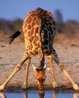
It was previously thought that giraffes are quiet animals that don’t make a noise, however research now suggests that giraffes in fact hum mostly at night, with the occasional snort or grunt.
Kada uistinu dođe taj trenutak – stojite ispred vrata vrtićke sobe i znate da sad svatko ide svojim putem – učinite to što brže.
Marija Marković - 25 Director of sales at Tvrtka, Zagreb
Blockquote with Image
It was previously thought that giraffes are quiet animals that don’t make a noise, however research now suggests that giraffes in fact hum mostly at night, with the occasional snort or grunt.
Cards
card--post
card--project Default Small
card--project card--featured
card--initiative
Initiative
Helping vultures in eastern botswana
card--team
Dr Sugoto Roy
Coordinator; Integrated Tiger Habitat Conservation Programme
Dr Sugoto Roy
Coordinator; Integrated Tiger Habitat Conservation Programme
card--testimonial
We must be different, original, surprising and we have brands that precisely this gap grow to a unique experience of luxury.
We must be different, original, surprising and we have brands that precisely this gap grow to a unique experience of luxury.
card--hover
lacoste
Our award-winning partnership with Lacoste illustrates the untapped potential in leveraging nature conservation for species and businesses alike.
View the projectEuropean union
The European Commission's DG DEVCO co-funds SOS African Wildlife, which protects key threatened African species while supporting communities whose lives are deeply connected to the same landscapes and habitats.
View the projectSpecies
We have been supporting Tiger conservation for five years. We announced that over the next 3 years, we will dedicate more than $1.1million to new initiatives aimed at protecting the Goitered Gazelle and Snow Leopard in Kazakhstan,
View the projectOther text inline elements
<mark> - You can use the mark tag to
highlight text.
<del> - This line of text is meant to be treated as deleted text.
<s> - This line of text is meant to be treated as no longer accurate.
<ins> - This line of text is meant to be treated as an addition to the document.
<u> - This line of text will render as underlined
<small> - This line of text is meant to be treated as fine print.
<strong> - This line rendered as bold text.
<em> - This line rendered as italicized text.
<b> - This line rendered as bold text.
<i> - This line rendered as italicized text.
| Class | Example |
|---|---|
| Text transformation utilities | |
.tt-lower |
Lowercase text |
.tt-upper |
Uppercase text |
.tt-cap |
Capitalize text |
.tt-none |
No text transformation |
| Font weight and style utilities | |
.fw-normal |
Font weight normal |
.fw-bold |
Font weight bold |
.fs-normal |
Font style normal |
.fs-italic |
Font style italic |
Alignment utilities (these utility classes have breakpoint modifiers, IE: .ta-md-right, .ta-lg-center, etc.) |
|
.ta-right |
Text align right |
.ta-center |
Text align center |
.ta-left |
Text align left |
Buttons
| .btn .btn--alpha | w/ icon | .btn .btn--beta | w/ icon | |
|---|---|---|---|---|
| Normal | Button | Button | Button | Button |
| Active | Button | Button | Button | Button |
| Focus | Button | Button | Button | Button |
| .btn .btn--gama | w/ icon | .btn .btn--delta | w/ icon | |
|---|---|---|---|---|
| Normal | Button | Button | Button | Button |
| Active | Button | Button | Button | Button |
| Focus | Button | Button | Button | Button |
Icons
Add icons in text or buttons. The default size of the icon is 2.4rem x 2.4rem. All <svg> elements have fill: currentColor set so the color follows the parent color.
Dropdowns
Dropdown
Forms
Use .form-control to style all input elements except where otherwise noted.
File and Range
For file and range, use .form-control-file.
NOTE: this is not a modifier of .form-control.
Disabled forms
Add the disabled attribute on an input to prevent user interactions and change the styling or add disabled to a <fieldset> to disable all fields.
NOTE: type="file" and type="range" don't have any special styling for disabled except the browser defaults.
Adding disabled to every input example:
Adding disabled to a <fieldset> example:
Readonly
Use attr readonly to disable interactions and change the style. Also use .form-control--text to make a readonly field look like plain text.
Checkbox and radio
Each checkbox and radio <input> and <label> pairing is wrapped in .form-check.
Browsers that support appearance property will get the styled checkbox and the ones that don't support it will get the default browser styled checkbox. Check this section in Internet Explorer 11 to se how the default fallback looks like.
Inline checkbox and radio
Inline checkbox and radios are not supported in Internet Explorer (bug). If you need that option to work in Internet Explorer 11 use the grid and .col-auto to achieve a similar result or add min-width to .form-check--inline.
Checkbox and radio with a link
Useful for adding links to terms in checkbox and similar.
Additional helper elements
- Use
.form-blockfor a wrapper for each input element that adds bottom margin. <label>for input get's styled via element selector but add.form-labelfor additional styling required for form validation.- Use
.form-textfor additional text under input elements for feedback or instruction for the user. - Hide
<label>with.sr-onlyto make it accessible. - You can also use Bootstrap spacing utility classes on labels or add additional elements you need to add.
Here is some text that is just a paragraph with a smaller bottom margin than default.
Enter a valid e-mail addressHere is some text that is just a paragraph.
Form validation
Add .is-valid or .is-invalid class to .form-block.
NOTE: Requires all form elements to be wrapped in .form-block because we are changing the appearance of some of the additional form elements based on the form field validation state.
Use the buttons bellow to check all the states.
Banners
Banner v1
Banner v2
Banner v3

Tabs
Fashioned at last into an arrowy shape, and welded by Perth to the shank, the steel soon pointed the end of the iron; and as the blacksmith was about giving the barbs their final heat, prior to tempering them, he cried to Ahab to place the water-cask near.
"No, no – no water for that; I want it of the true death-temper. Ahoy, there! Tashtego, Queequeg, Daggoo! What say ye, pagans! Will ye give me as much blood as will cover this barb?" holding it high up. A cluster of dark nods replied, Yes. Three punctures were made in the heathen flesh, and the White Whale’s barbs were then tempered.
"Ego non baptizo te in nomine patris, sed in nomine diaboli!" deliriously howled Ahab, as the malignant iron scorchingly devoured the baptismal blood.
Oh, lonely death on lonely life! Oh, now I feel my topmost greatness lies in my topmost grief. Ho, ho! from all your furthest bounds, pour ye now in, ye bold billows of my whole foregone life, and top this one piled comber of my death! Towards thee I roll, thou all-destroying but unconquering whale; to the last I grapple with thee; from hell’s heart I stab at thee; for hate’s sake I spit my last breath at thee. Sink all coffins and all hearses to one common pool! and since neither can be mine, let me then tow to pieces, while still chasing thee, though tied to thee, thou damned whale! Thus, I give up the spear!
Who told thee that?" cried Ahab; then pausing, "Aye, Starbuck; aye, my hearties all round; it was Moby Dick that dismasted me; Moby Dick that brought me to this dead stump I stand on now. Aye, aye," he shouted with a terrific, loud, animal sob, like that of a heart-stricken moose; "Aye, aye! it was that accursed white whale that razeed me; made a poor pegging lubber of me for ever and a day!" Then tossing both arms, with measureless imprecations he shouted out: "Aye, aye! and I’ll chase him round Good Hope, and round the Horn, and round the Norway Maelstrom, and round perdition’s flames before I give him up. And this is what ye have shipped for, men! to chase that white whale on both sides of land, and over all sides of earth, till he spouts black blood and rolls fin out. What say ye, men, will ye splice hands on it, now? I think ye do look brave.
Donations